iPaintMySpace
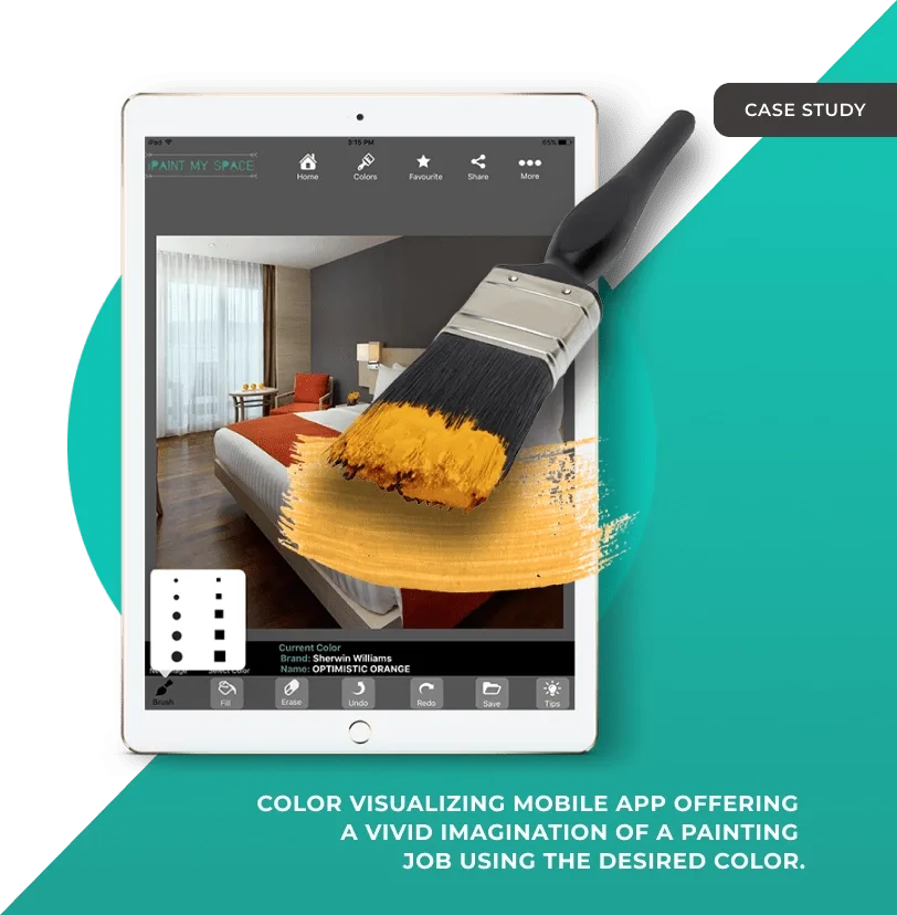
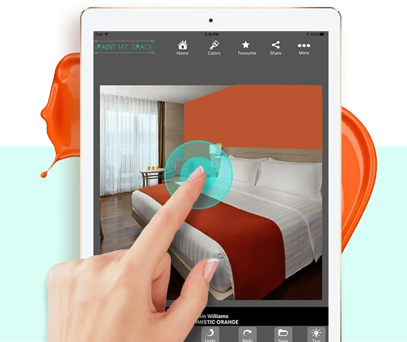
A paint colour visualiser for iPad. Photograph a room, tap a wall, and see it in a real colour from a real brand, with the brush, fill, undo and redo to try another one.
Overview
iPaintMySpace lets somebody see a wall in a colour before they buy the paint. Take a photograph of the room, tap the wall, and it fills with a real shade from a real brand’s range.
Painting a room is expensive and the colour rarely looks the way it did on the chip. The client wanted to take the guesswork out of it.
This is now a feature most paint companies offer. In 2016, when we took the project on, it was not: there was no obvious product to look at and copy, which is the part of this story worth telling.
The team took an idea with no reference implementation and made it work well enough that the app found a real audience among people about to repaint a house.
The main difficulty was the lack of references. There was no user testing to draw on and no design validation to borrow, so the project started from a blank slate.
The client needed a partner for more than the build: with no precedent to follow, the go-to-market thinking had to happen alongside the engineering.
They came to us still forming the idea, and with no technical experience of their own. We acted as an extension of their team: advising on what the technology could actually do, then UX strategy, UI design, development, and defining the brand’s digital style guide.
The product also had to launch with a limited feature set and grow from there, so it needed to be scalable enough to carry more users and more of their requirements without being rebuilt.
We started by understanding the demographics, the user personas with their goals, needs, habits and frustrations, the brand positioning and the objectives, gathered through workshops rather than assumed.
What we built is flexible, scalable and robust, and simple at the point it matters: one touch to see a wall in a colour.
The result works for someone browsing and for someone who already knows what they want: both end up with a colour, a brand and a code they can walk into a shop and buy.
“Sphinx Solutions helped us develop this paint visualiser application in the given timeline. We are glad that we found and chose them as our technology partner. The entire team is so motivated to bring perfection to each and every task.”
Tech stack
What people usually ask about iPaintMySpace and about building something like it.
Define the requirements, research the market properly, and settle the business model before design starts. Then UI design and a prototype, the technology choices, the development environment, testing for usability rather than only for bugs, and the store submission. On a visualiser the usability testing matters more than usual, because the whole product is one interaction.
Getting a colour to sit on a photographed wall convincingly. The app has to work out what is wall and what is not, respect the light and shadow already in the photograph, and do it fast enough to feel like a single tap. Get that wrong and the colour looks painted on, which defeats the point.
Broadly $30,000 to $100,000, depending on how complex it is, what is in it, which platforms it ships on and who builds it. A focused visualiser sits at the lower end of that. Our app cost calculator will price your own brief, or tell us what you have in mind and we will.
It depends what you are trying to do. Houzz is for browsing and inspiration, IKEA for furnishing a room from a catalogue, Magicplan and Planner 5D for floor plans and layouts. iPaintMySpace does one thing: shows you a wall in a colour you can actually buy. Picking the right one is mostly about which of those jobs you have.
Connect with us

